

PROBLEM
I was hired by M&D: a secondary glazing company with 15 locations in the south west of England, after pitching my designs for a training manual application, having observed that their training of newly hired employees could be improved in the interest of efficiency and employee satisfaction. The company had been planning expansion into London and northern counties across the UK and was preparing to double its workforce. I presented the following case study to the director and upper management to demonstrate how a training manual application could expedite the employee learning journey to facilitate the company’s growth.
The training of new employees had been delivered solely by demonstrations and while this is widely accepted as a highly effective form of learning, there were too many processes to be learned and remembered simultaneously to make it effective. New employees tended to forget preparation and steps in their work which caused them to make mistakes, putting a strain on project managers and wasting company time and resources. The uniformity of the work was also an issue as there were no set standards for completion.


SOLUTION
While the demonstrative teaching method was essential, there was a need for an additional training resource in the form of a manual to keep workers on track. The app would need to be accessible at all times on employees’ personal devices in order to be used at project sites for it to be most effective.
I noted that the company was somewhat of an outlier in its field as the processes involved in the work they do spans multiple disciples within the construction and glazing industries, creating a need for very specific training which is unavailable elsewhere. No matter the level of skill and experience of employees, the cross discipline requirements of the work ensured that newly hired employees would be learning at least some of the processes they would be using on the job from scratch. I hypothesised that the application would also allow the company to hire less experienced workers while still ensuring they were able to succeed at the job, broadening the pool of applicants the company could hire from.
SUCCESS METRICS
APP
Time on section: How long it takes for the user to navigate a specific task section, providing insight into how intuitively the task is described (in app measurement or timed by Project manager).
User satisfaction: A measure of the level of satisfaction the user has with the overall design and functionality of the app (in the form of surveys & questionnaires).
Engagement: The level of engagement users have with the app, such as the number of pages viewed or the time spent on the app (in app measurement or surveys & questionnaires).
EMPLOYEES
Frequency of mistakes recorded by project managers.
Time taken on tasks on site recorded by project managers.
Quality of work recorded by project managers.
Job satisfaction and employee wellbeing (in the form of surveys & questionnaires).
COMPANY
Frequency of care job requests recorded by M&D office staff.
Hiring rates and expansion rates recorded by M&D office staff.
Project Timescales recorded by M&D office staff.
Spending and budgets recorded by M&D office staff.
Speed of promotions recorded by M&D office staff.
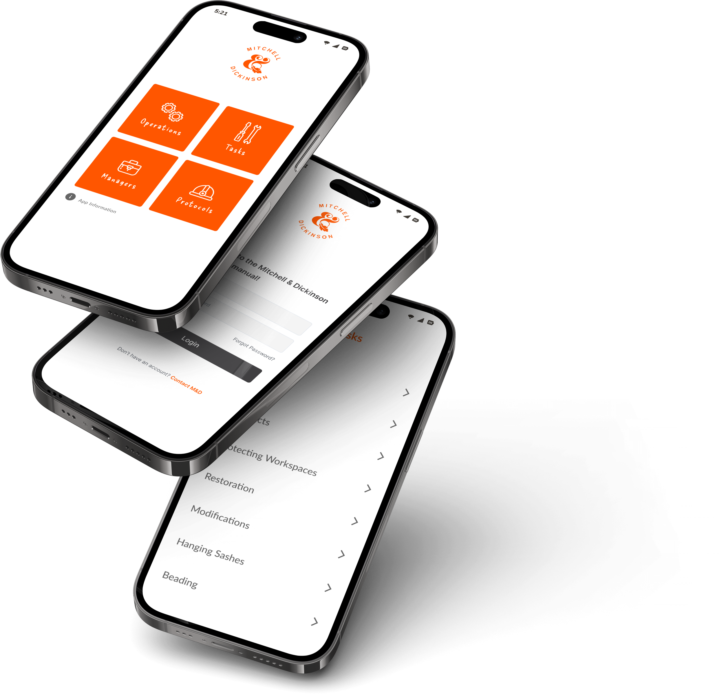
Simplicity and functionality, essential for scannability and daily use


Clear and descriptive illustrations and diagrams for the best comprehension of tasks
LOW FIDELITY WIREFRAMES

INTERVIEW RESULTS AND INFLUENCE
In the early design stages I conducted user interviews with newly hired employees to gauge what would help them most so I could focus on any pain points as the project developed. The interviews identified a pattern of information which indicated the most desirable solutions the app could provide to employees:
There should be a focus on the modification tasks which are unique to M&D and need to be learned by all employees regardless of their backgrounds or levels of experience.
That videos and step by step guides would be the desirable mediums for the material.
That short form videos would be preferable to longer ones.
That written instructions with diagrams would be acceptable as long as they are step by step, broken down into manageable instructions and that they demonstrate movement.
That the focus should be on visualisation and movement.
That a reference is needed as people do forget things but there should still be demonstrations as a starting point for new employees to encourage muscle memory.
That there is a frustration with inconsistent/undefined standards and that setting standards across teams would improve job satisfaction as well as upholding the overall product and reputation of the company.

I was pleased to find that the interview results largely confirmed my original hypothesis. They also yielded useful information and ideas for future development of the project. Below are the notes I made as a result of the interview findings on the progress of the project up to this point. I outlined a plan on how to move forward from here which I submitted to management for review:
I believe this is a good time to have the designs so far reviewed by a trusted project manager, the material should be approved before being made available to employees.
I will review the colour language I have used in the project up to this time for usability. I will still need to trial a prototype on employees to get a better sense of it’s effectiveness.
I will review the structure of written instructions to see if they can be clearly understood. It may be that the format can be adjusted (ie bullet points) but this will also require some user testing with a prototype for employees.
I will review the categorisation of the learning material tasks. I have found as I have been going through them, some ambiguity on where each belongs and I will likely change this for improved usability.
Over the course of the interviews it has become clear that there are some tasks which are outliers and which it would be impractical to try to write material for, because of their unorthodox nature. In these situations employees will still have to defer to the judgement of a project manager. I will find a way to make this clear within the app.
It’s clear that video and movement are integral to properly demonstrate tasks. My concern is that the budget is not big enough allow for professional filming and production of video material. Also, because the app is mobile only, the size of the screen that employees will be viewing video material on has to be considered, as footage where wide shots are used may prevent them from properly viewing the tasks depicted. I am trying to think of solutions to these problems- here are some ideas I have had: if the budget allows, the filming could be restricted to capturing only the crucial modification tasks as it appears these will be the most useful to employees. For the rest of the tasks it may be possible to collect footage from existing employees themselves (though the quality of it won’t be as good). Another alternative I have been considering is animation but I first have to test the possibilities with this, which is something I will be looking into in the next phase of the project.


REVIEWS AND FEEDBACK
The material was reviewed with a middle manager who was able to give excellent feedback. He highlighted requirements and provided technical drawings, some of which I transcribed to screens. This was just one of multiple review sessions which have been conducted over the course of the project. Figma comments were used to annotate screens for each subsequent iteration cycle. Though the screens can’t all be showcased in detail due to an NDA, the screenshot below gives an idea of the scale of the project. I also arranged physical site visits with the same manager to help me transcribe tasks to screens. I did this by taking photos, video and sketching on site for later digitisation.

DEVELOPMENT AND MOCKUPS


USER TESTING
A first round of testing yielded some important information upon which a number of changes were made. The test subjects were newly hired employees of M&D since these will be the primary users of the application. I was very aware of the critical importance of this design phase in order to gauge the application’s usability and viability which is why I made it a special focus. I expect to receive further criticism and feedback in a second round of user interviews and walkthroughs which are currently underway, after which it will be possible to make more changes and improvements to designs based on the data collected.
Over the course of interviews and cognitive walkthroughs, I take extensive notes for future evaluation to help assess the interface learnability. I look for pain points and any difficulty with interpretation of the material. I gather qualitative data in the form of the user’s immediate reactions and emotions while interacting with the product followed by quantitive data in the form of targeted A/B testing with a focus on any material which shows a pattern of being misinterpreted. In these cases, revised illustrations and animations are presented as alternatives for the test subjects to choose from with a view to replacing the originals.
I tried to focus on the participants showing me, rather than telling me, what they were thinking as they navigated the app. Instead of asking them questions like "Do you understand what 'XYZ' on the homepage means?" as in interviews (in which case participants do not always answer accurately or honestly out of fear of saying the wrong thing) I asked them questions that required them to demonstrate their understanding like "Imagine you want to learn XYZ. How would you do that?". I did this because I wanted to give them tasks that made them hunt for the answer so I could experience them problem solving in real time. I tried to use layman’s terms rather than UX jargon for both the walkthroughs and interviews in the pursuit of clarity and honest feedback. The walkthroughs were recorded for better analysis after the test was complete.
I will later be user testing project managers, middle and upper management on the same basis with the caveat that their approval must be factored into the shaping of the final product as they will have the final say. Upper management have already given some feedback on the most recent iteration of designs and made requests such as in screen alerts and reminders for general working practices. These have been implemented and I expect there will be other previously overlooked requirements to implement later down the line.

